Creating visualization via Manual Charts and "Show Me" option in Tableau:
Updated: Mar 13, 2025
Introduction
To create data visualizations in Tableau, we have two different options: Manually creating the charts by drag and drop the fields and one more is by using the "Show Me" panel options to create charts or visuals quickly. Both the way of creating charts have their advantages and uses. In this blog, we’ll analyze these two ways with an example and helps to make decision which one is better while creating visuals.
"SHOW ME" panel options:
The "Show Me" panel is a built-in option in Tableau that suggests chart types based on the fields that we select. It generates a fast way to create charts without manually dragging & dropping the dimensions and measures.
Advantages of Using "Show Me":
Fast and easy to understand.
Automatically selects a desired chart.
Reduces trial and error in visualization selection.
Disadvantages of Using "Show Me":
Limited options to customize the chart.
Might not be able to create best and accurate chart for the analysis.
Needs manual formatting for better visualization.
MANUAL CHART:
Creating manual charts makes to drag & drop the dimensions and measures onto the desired place (Rows, Columns, Marks, Filters, Pages) to create visualizations from the very beginning.
Advantages of Manual Chart:
Fully controlled to create the chart design, formatting, and interaction.
Advanced customizations like calculated fields and custom tooltips can be created.
More convenient for complex dashboards with specific user requirements.
Disadvantages of Manual chart:
Requires a deeper knowledge of Tableau’s functionalities and use cases.
Needs longer time to create charts compared to the "Show Me" option.
Hands-on Example: Sales by Category (Bar Chart)
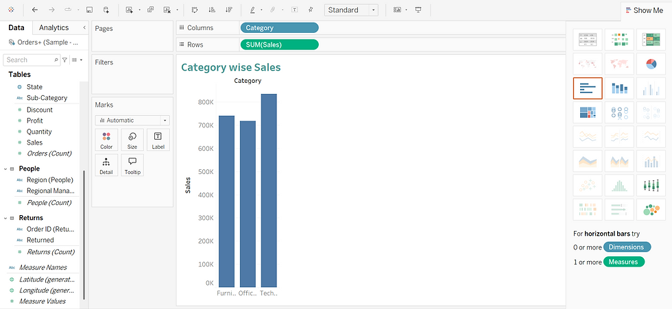
In this blog I am using "Sample Superstore" dataset to generate a Category wise Sales Bar Chart using both "Show me" and "Manual chart" methods.
By using "Show Me"
Connect to the Sample - Superstore dataset.
Drag Category to Columns.
Drag Sales to Rows.
Open the Show Me panel and select Bar Chart.
Creating the chart Manually (DONUT CHART)
Connect to the same dataset as in the above i-e; Sample - Superstore dataset.
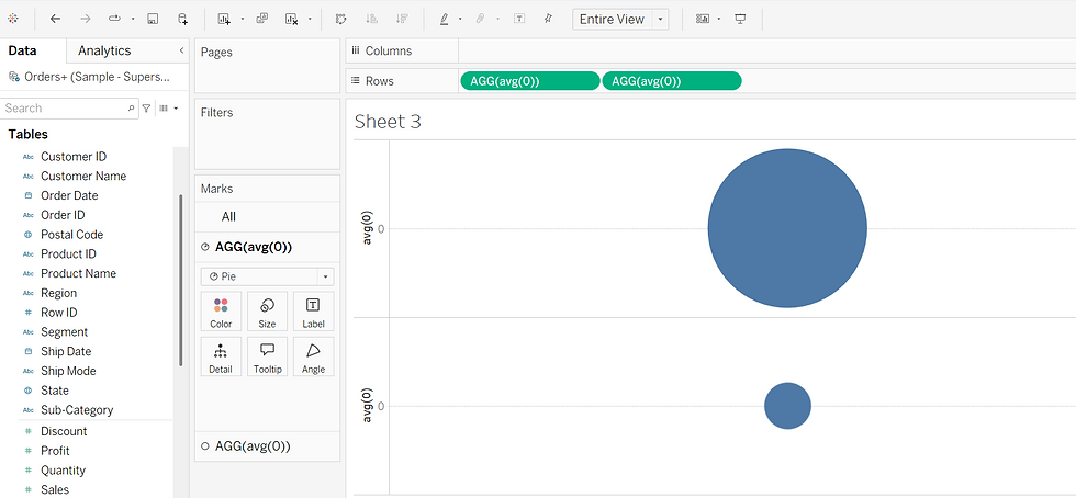
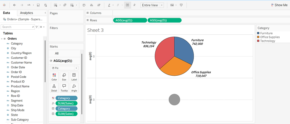
Creating DONUT chart Manually using marks.
Following are the steps to create donut chart manually with snapshots explained.

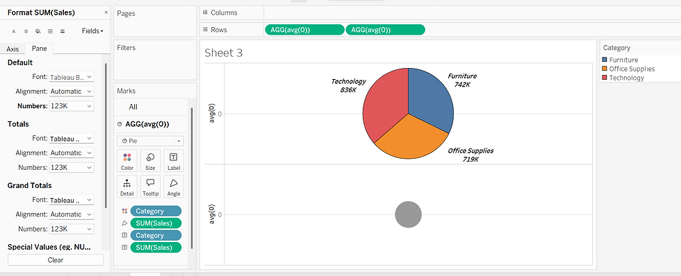

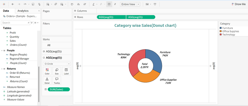
Apply filters or formatting for a polished look.
Key Differences between "Show Me" and "Manual Charts"
Feature | "Show Me" Option | Manual Chart Creation |
Accuracy | Faster, automatic | Slightly longer, manual |
Customization | Limited | Full control |
Formatting & Sorting | Requires adjustments | Customizable during creation |
Best For | Quick insights, beginners | In-depth analysis, professional dashboards |
👉 Can use "Show Me" when we need a quick visualization or are unaware about the better chart type.
👉 Can use "Manual Chart Creation" when we need continuous, advanced customized visualization in the dashboard.
Conclusion
Both methods have their use in Tableau. If we are beginner better to start with "Show Me" to explore different chart types. As we gain experience & knowledge, manual chart creation will give greater flexibility and storytelling content.


