Creating a Butterfly Chart in Tableau for Comparative Data Analysis
What is a Butterfly Chart?
A Butterfly Chart, also called a Tornado Chart, is a special type of Bar Chart that shows two sets of data side by side. It looks like a butterfly because the bars spread out in opposite directions to form a center line. Butterfly Charts are often used to compare two groups like male vs female, sales vs returns, or planned vs actual numbers. One set of bars goes to the left, and the other set goes to the right, making it easy to see the differences at a glance. Butterfly charts are great for making quick, clear comparisons between two related things!
Why we Use a Butterfly Chart?
Easy Group comparison: The biggest reason to use a butterfly chart is to easily compare two related groups across the same categories.
Organized view: The mirror effect keeps everything neat and structured.
Spotting Trends and Differences: If we see a longer bar on one side, we instantly know that one group has a higher count than other. If the bars are similar lengths, it shows balance between the groups.
Efficient Use of Space: It saves dashboard space while still giving a full side-by-side comparison.
Better story telling: Butterfly charts make our story easier to tell. Whether we are showing gender differences, market shifts, or patient behavior, the mirrored layout naturally pulls your audience into comparing the two sides.
Now let’s see how to create a Butterfly Chart by comparing the male and female count for the Primary Diagnosis.
We are using the Quality Dataset, where we have the details of Patients, Ambulatory Visits, ED Visits, Discharges and Providers. We are going to visually compare the number of male and female patients across different primary diagnoses, like Pneumonia, chest pain, migraine etc.
To create any chart, we need Measures and Dimensions. We are using Primary Diagnosis as Dimensions and Male and Female as Measures. Here we don't have a separate Measure called Male or Female in the dataset. We are creating it manually.
First we need to create a calculative fields for Male and Female. Based on the Patients details(Patient ID) we are separating Male patients and Female patients. Below is the calculative field for Male. Similarly we need to create one for female.

Now drag the Dimension Primary Diagnosis to the row and the Measure calculative field (Male) to the column. By doing this we get a horizontal bar graph. Then drag the other Measure calculated field (Female) to the axis as shown below to get Measure Values and Measure Names.
Measure Names is a special field in Tableau that lists the names of all the measures (numeric fields) in our data. Where as Measure Values is another special field that contains the actual numbers (the values) for all the measures.
In Simple, Measure Names and Measure Values help us to bundle multiple measures together in a single chart.

By dragging the Measure Names from Rows to Colors under Marks card, we will be getting a stacked bar as shown below, which will be used for comparing two values. Sorting the Bar Chart by descending will be easy for creating Butterfly effect.

Since we are comparing both the values by count and not by sum, we are changing SUM (Male) from the Measure Values card to CNT(Male). Similarly we are changing SUM (Female) to CNT (Female) .

Double click on CNT (Male) and make to negative (- sign). This is how we create the effect of butterfly where we have the right and left wings.

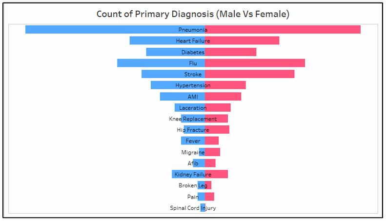
Now we can see that one bar is spreading out in opposite direction making the illusion of a butterfly wings.

Here we need the Primary Diagnosis in the middle of the spine (Butterfly). For this we need one more calculative field called Zero axis with the value 0.
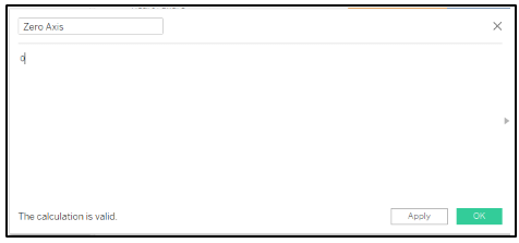
Add the calculative field (zero axis) to the Column to create dual chart. From the marks section, change the sum (Zero axis) from Automatic to Text and add the Primary Diagnosis (dimension) to the Text(Label)

The next important step is to create a Dual Axis by right clicking onto the Zero Axis in the Columns Field and select Dual Axis. Tableau automatically changes the type of the Visualization to automatic (circle).

We can change the type in the Marks Card from Automatic (circle) back to Bar Charts for the Measure Values.

Now we will be finishing the Butterfly chart with few formatting.
Removing the on the left by right clicking and disable the Show Header.
Removing the header for Zero Axis and Value.
Changing the color of the Bar Charts to differentiate between Male and Female.
Changing the color of the Text of Zero Axis to black.
Removing the Zero lines and the Grid Lines.
Giving the Title for the chart.
After formatting the final Butterfly Chart will look like this.
Conclusion:
In short, butterfly charts turn complex comparisons into clear, intuitive visuals making our data more engaging and our insights much easier to communicate. If we want a chart that’s both eye-catching and highly informative, the butterfly chart is definitely worth adding to our visualization toolbox.


