Cracking Antibiotic Resistance: A Fast, Data-Driven Look at β-Lactamases

Being a Research Associate, I didn't expect a routine lab assignment can drag this deep into one of modern medicine's most pressing unsolved problems. Antibiotic resistance isn't new — but the pace at which it's spreading is alarming in ways that don't always make the headlines they deserve.
What I was studying specifically: Metallo-β-lactamases, or MBLs, a class of enzymes that bacteria use to destroy β-lactam antibiotics, including carbapenems, which are literally the drugs of last resort. When those stop working, we run out of options fast.
The dataset I studied for my analytics spans 820 resistance records, 10 organisms, 6 resistance mechanisms, 18 countries, and 4 years of surveillance. I benchmarked everything against the WHO global data to understand where we actually stand. (1,2)
The WHO estimates AMR was directly responsible for 1.27 million deaths in 2019, with 4.95 million deaths associated with bacterial AMR. This is not a future problem — it's happening now.
COVID Made It Worse
One pattern jumped out immediately in the data: resistance rates climbed during and after the COVID-19 pandemic. It makes sense in retrospect — when hospitals were overwhelmed and clinicians were fighting for survival, antibiotics were sometimes prescribed defensively for viral co-infections [6]. That pressure selects for resistance.

Chart 1: Antibiotic resistance rates rose steadily from 2019 through 2022, with the sharpest jump post-pandemic.
Pre-COVID (2019): 43.7% resistance. COVID peak (2020–2021): 44.5%. Post-COVID (2022): 47.2%. That's a 3.5 percentage point rise — an 8% relative increase in just three years. The pandemic didn't create the resistance crisis, but it accelerated it.
The Most Dangerous Pathogens in This Dataset
Not all resistant bacteria are equally threatening. The chart below maps resistance rates across the major Gram-negative organisms in this dataset — and the numbers don't always line up with what you'd expect.
E. coli comes in with the highest cumulative resistance rate, followed closely by Enterobacter. That might sound alarming, but raw resistance rate isn't the whole story. Klebsiella, Acinetobacter, and Pseudomonas sit lower on this chart — but when you factor in mortality, that ranking flips entirely.
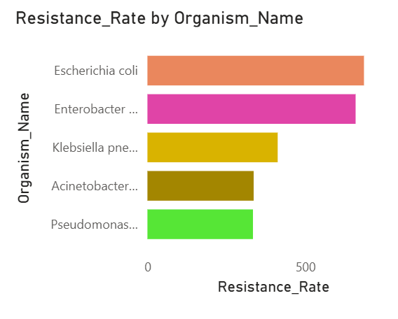
Chart 2: E. coli and Enterobacter show the highest resistance counts by volume, but A. baumannii (38.5% mortality) and P. aeruginosa (37.9% mortality) are the ones clinicians lose sleep over.
A. baumannii and P. aeruginosa are both WHO Critical Priority pathogens [2] — not because they're the most common, but because when treatment fails, patients have almost nowhere left to turn. E. coli's mortality rate sits at 12.0% by comparison. Volume and danger are two different measures, and this chart is a good reminder that the longest bar isn't always the scariest one.
Why Beta-Lactamases Are the Ones to Watch
Resistance doesn't come from a single playbook. Bacteria have figured out several different enzymatic routes to neutralize antibiotics, and this dataset captures all of them.
AmpC leads the mechanism count at 24% of isolates — the most represented class here. ESBL, MBL, OXA-48, and KPC each account for roughly equal shares of the remaining isolates. But mechanism frequency isn't the same as clinical danger, and that's where MBLs stand apart.

Chart 3: AmpC is the most common mechanism in this dataset at 24%, but MBLs — at 18% — carry the highest clinical threat because they chew through carbapenems, the last line of antibiotic defense.
MBLs do something the other classes largely can't: they destroy carbapenems, which are the drugs reserved for when everything else has already failed. And they don't stay put — the genes behind them (NDM-1, VIM, IMP) travel between bacteria through plasmid transfer, which means one resistant strain can share that capability across an entire ward, or across borders [4]. NDM-producing bacteria have spread from South Asia into Europe, Africa, and beyond, which is exactly why the WHO flagged them as a global health security priority [2].
The pie chart shows a relatively even distribution across mechanisms. That's actually the concerning part — resistance here isn't concentrated in one pathway. It's coming from multiple directions at once.
Geography Shapes Risk
Resistance isn't distributed evenly. Where you are in the world dramatically shapes your exposure risk — and your access to solutions.

Chart 4: SEARO leads regional resistance rates at 649.60 — Southeast Asia's high burden reflects dense population, antibiotic accessibility without prescription controls, and historically under-resourced surveillance systems.
SEARO — Southeast Asia — carries the highest resistance burden in this dataset at 649.60, sitting well above the 51.6% midline marker on the chart. The Americas (AMRO) and Europe (EURO) follow, which is somewhat counterintuitive given that high-income regions tend to have stronger stewardship programs. WPRO sits close behind EURO, while AFRO actually records the lowest resistance count here at 335.31.
The WHO report is explicit about this: lower reported numbers in low-income regions often signal surveillance gaps rather than lower actual burden [1, 5].
Resistance Has Left the Hospital
Here's something that surprised me: non-ICU resistance rates (49.7%) are actually higher than ICU rates (42.2%) in this dataset. ICUs get most of the surveillance attention — and for good reason — but resistant organisms are clearly spreading well beyond critical care.
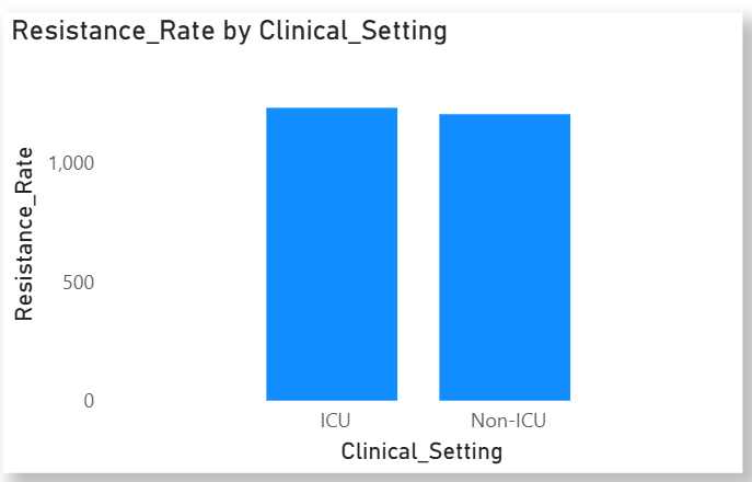
Chart 5: Non-ICU settings show higher resistance rates (49.7%) than ICU settings (42.2%), indicating community-level spread.
This matters because community-acquired resistant infections are harder to track, harder to contain, and often diagnosed later. The WHO’s Global Action Plan calls for exactly this kind of parity in surveillance between hospital and community settings [5].
The Financial Toll
Resistant infections don't just strain patients — they drain health systems. This chart puts a dollar figure on that.
Klebsiella pneumoniae is the most expensive to treat at just under $28K per case. Pseudomonas aeruginosa runs close behind at around $25K. From there, Acinetobacter, Enterobacter, and E. coli step down gradually, landing between $20K and $22K.
No dramatic outlier here — just a consistent, expensive range across the board. Every organism on this chart costs a hospital at least $20K per resistant case, before you factor in longer stays, failed treatment rounds, or ICU time.

Chart 6: Average treatment cost per resistant infection — Klebsiella leads at ~$28K, E. coli sits lowest at ~$20K. The gap is modest per patient, but across thousands of cases a year, it adds up fast.
Mapping the Superbug Matrix
This heatmap is where molecular surveillance gets powerful. It maps organisms against resistance mechanisms to identify which combinations are most dangerous — the emerging "superbug profiles.

Chart 7: Resistance heatmap — darker regions identify high-risk organism–mechanism pairings, supporting faster clinical and epidemiological decisions.
Darker cells signal stronger co-occurrence of organism and resistance class. This kind of visualization is practical: it helps clinicians anticipate which resistance mechanisms are likely in a given patient context and guides empirical antibiotic choices before full lab results return.
What This All Means
Antibiotic resistance isn't a single problem with a single fix. This dataset makes that clear. It's E. coli dominating the resistance count while Acinetobacter quietly kills at three times the rate. It's Southeast Asia carrying a burden that high-income regions with better-funded labs still haven't fully solved. It's resistant infections showing up in general wards just as often as ICUs — which means the problem has already left the building.
The COVID years pushed things further in the wrong direction, and the numbers haven't recovered. A 3.5 percentage point rise in three years doesn't sound catastrophic until you consider the scale — hundreds of thousands of isolates, 18 countries, organisms that share resistance genes across borders without a passport.
Even last resort antibiotic also showed resistance by these tiny monsters, which is scarier.
The data doesn't lie, it just waits for the right tools to give a picture, so that we can see clearly almost everything relevant to study, and where the forecasting is as well.
References
[1] WHO. (2022). GLASS Report 2022. https://www.who.int/publications/i/item/9789240062702
[2] WHO. (2017). Global Priority List of Antibiotic-Resistant Bacteria. https://www.who.int/publications/i/item/WHO-EMP-IAU-2017.12
[3] Murray et al. (2022). Global burden of bacterial AMR in 2019. The Lancet, 399(10325), 629–655.
[4] Yong et al. (2009). Characterization of blaNDM-1. Antimicrobial Agents and Chemotherapy, 53(12), 5046–5054.
[5] WHO. (2015). Global Action Plan on Antimicrobial Resistance.
[6] WHO. (2021). AMR in the Context of COVID-19: FAQs.


