Clock Face Duration Chart in Tableau

Good day everyone. This blog explains about our time distribution in a form of clock in Tableau.
Lets see an example of our workday as a duration clock.
Step1: Create a csv file with a simple values like below
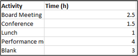
Step2: Import the csv to Tableau.
Step3: Create a calculated field ‘position’ as ‘1’ to plot the data on a starting position on the graph.

Step4: And add the position to rows and change it to AVG. Make a copy of that by pressing Ctrl + dragging the position field next to it.

Step5: Make the first chart as shape and select the preloaded shape as clock.
Step6: Make the second chart as pie and add the Time to angle, activity to color. Make it to entire view. Change the color as needed. Change color for Activity “blank” color as white.
Step7: Change to dual axis and synchronize the axis. Removed headers, remove grid lines and rows and column lines.
Step8: Reduce the opacity of the pie so the clock is visible. Change the order of the data as the axis starts at 0. To change the order of the data simply drag the data in the card.
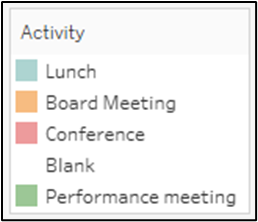
Step 9: Add labels as needed and format for the units from the Format Pane.
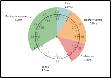
Your Clock duration chart is ready. Thanks for Reading.


