Charts in Tableau
- Vishwaala
- Oct 27
- 3 min read
In this blog we discuss the Charts in Tableau.
A chart is a representation of data, typically in the form of a graph, diagram, map, or table. In Tableau, A chart is a visualization tool that presents data in a graphical, tabular format to help users understand patterns and relationships.
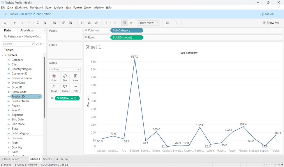
Line Chart
Lane charts are simple way to visualize trends over time by connecting individual data points with a line.
Use Cases for Line Charts:
Ø Time Series Data: Line charts are ideal for showing how a variable has changed over time.
Ø Comparing Trends: They allow comparing trends across multiple categories, provided the data series are comparable.
Ø Forecasting: Line charts are useful for forecasting future values based on historical patterns.
Bar Chart
A Bar chart allows us to compare numerical values, such as integers or percentages, using bars of different lengths.
Ø They use the length of each bar to represent the value of each variable.

Ø The horizontal axis typically represents a dimension (e.g., time), while the Vertical axis represents quantitative values.
Bar chart analysis:
Ø Comparing Subcategories: Bar charts are useful for comparing different values within subcategories.
o Example: Comparing how much money a small business spends on various expense types.
Ø Effectiveness of Strategies: Bar charts can be used to evaluate the effectiveness of different strategies or methods on achieving a goal, such as sales, stock portfolios, budgeting, or medical studies.
Ø Stacked Bar Charts: These can display additional detail within an overall measure.
o Example: In a sales chart, different colored blocks can represent different sales opportunities within the same bar.
Bar chart Rules:
Ø The base starts at zero.
Ø Ensure the axes clearly labeled.
Ø Colors should be consistent and defined.
Ø Avoid displaying too many bars
Ø keep bar at the same width.
Ø Avoid overcomplicating with too many subcategories.
Ø Always Label the axes.
Histogram Chart
A histogram is used to track the distribution of values in a dataset, usually represented as a series of connected bars. It is especially useful for displaying continuous, numerical data.

Key features of a Histogram:
Ø This histogram uses only one color.
Ø They display data from one measure and are useful for estimating the Average.
Ø Histogram break continuous data into bins or groups based on a specific range.
Reading Histogram chart:
Ø The bars represent the frequency of data points within a specific range(bin).
Ø The distribution of the bars can reveal patterns, such as skew in the data.
Types of Distribution Patterns:
Bimodal Distribution – this Distribution has two peaks.

Ø Example: This frequencies shows 2 distinct peaks. They raise to a maximum at first at 21-30 range and again 51-60 range with lower frequencies at the beginning and at the end.
Plateau Distribution – here raises to a certain level and stays there for most of the bins.

Ø Example: The counts rise to a stable, high level (the plateau) in the middle ranges (41–60) before tapering off on the ends.
Edge peak distribution – Which looks like a normal frequency distribution, except one bin at the end is higher than the rest, serving as a sort of tail.

Ø Example: The counts follow a roughly bell-shaped curve until the final value range (91–100), which has an unnaturally high frequency.
When we use Histogram:
Ø To explore how members within a category in a dataset are distributed (ex: breakdown of salaries).
Ø When working with one continuous, numerical value that can be split into multiple bins.
Ø We are looking to understand the distribution values within a single category.
Ø Provided data has been correctly scaled.
Pie chart
A Pie chart helps to show data as percentage of a whole, with each slice representing a portion of the total.

Reading a Pie Chart:
Ø When reading a pie chart, you should consider the area, arc length, and angle of every slice.
Ø Pie charts are ideal for showing the relationship between parts of the whole.
Ø They work well when you have a small number of categories (typically 2-5).
Ø A pie chart is useful for seeing if one category significantly outweighs the others.
Conclusion:
Each chart type in Tableau serves a specific purpose, helping users to understand and communicate data patterns effectively. Weather you are looking for track trends, compare categories, or explore distributions, selecting the right chart is key to clear and insightful data visualization.
Additional Tips:
Ø Line Charts are great for time-based data and forecasting.
Ø Bar Charts help in comparing quantities and subcategories.
Ø Histograms are your go-to for understanding data distributions.
Ø Pie Charts are useful for simple comparisons of parts to a whole, but avoid using them with too many categories.
Source : https://www.tableau.com/chart#


