Building real time alerts in tableau for nurses and doctors: Colour-Coding Abnormal Values and Email Notifications
- Lekshmi Geetha Rani

- Sep 2
- 5 min read

source:eNursing
In healthcare, abnormal values of vital signs need immediate attention, as a slight delay can cost a patient their life. With the use of data visualization, we can create a digital dashboard for nurses and doctors using tableau, which will highlight anomalies and help in timely intervention.
For my project , I worked on a dataset of sepsis patients (https://www.kaggle.com/code/namratakapoor1/sepsis-classification/output), where one of the requirements was to identify when a patient entered SIRS(Systemic Inflammatory Response Syndrome) condition. All sepsis patients showed symptoms of SIRS initially, so detecting SIRS early can be an early warning for sepsis.
🩺Why sepsis matters in healthcare?
Sepsis is body’s extreme response to an infection, and it can quickly become life threatening if not detected early. Sepsis causes at least 11million deaths per year and is also the number one cause of death in hospitals (source: sepsisfacts ). This puts a lot of pressure on the healthcare system. Any tool or method which can help detect sepsis earlier, will significantly reduce these numbers.
🦠SIRS: Early warning stage of sepsis
SIRS is an exaggerated response of our body either due to infections(sepsis) or due to non- infectious causes like trauma, burns or pancreatitis. The five biomarkers, which are monitored to detect SIRS are Heart Rate, Temperature, Respiratory Rate, PaCO2 and WBC count. A patient is said to have SIRS when two or more of these biomarkers goes to abnormal values as shown below:

So, developing a real time alert system for SIRS will highly benefit nurses to notify doctors before the patient’s condition worsens. So let me walk you through how, I achieved such a system in Tableau by using colour coding for abnormal values and email notification feature for timely communication as shown below:

Dataset overview
The dataset is quite large, with size of the sample being 1.5 M, that is, there were 1.5M rows in the dataset each representing a measurement or event for a patient. There were 40,336 unique patients, whose 43 biomarkers were monitored hourly for 2 weeks. Since the dataset contains hourly measurement of biomarkers, we can also show the exact hour at which the patient transitioned to SIRS.
In the visualisation two timestamps are taken into consideration
1) Trigger hour - the exact hour two or more biomarkers went into abnormal range.
2) Transition hour – which is one hour before the trigger hour.
Step-by-step procedure to achieve the goal of colour coding the abnormal values and set up email notification
Step 1: Connect to the data
· Load the sepsis dataset (from the link shared above) into Tableau
Step 2: Create calculated fields for SIRS criteria and Email alert
· Go to the sheet tab and create calculated fields to classify each of the five biomarkers as abnormal and normal according to the SIRS criteria. For example, I created calculated field for heart rate as shown below (returns 1 if abnormal else 0)

· Create calculated fields ‘Trigger hour’ (the first hour a patient transitioned to SIRS) and ‘Transition hour’ (one hour before)


· Create a new calculated field called ‘Hour_Label’, to classify the hour as ‘Trigger’ and ‘Transition’ based on the above fields.

· Next, create a calculated field for sending an email alert at the trigger hour as shown below. The email symbol is added using Unicode.

Step 3: Colour coding biomarkers using placeholder technique
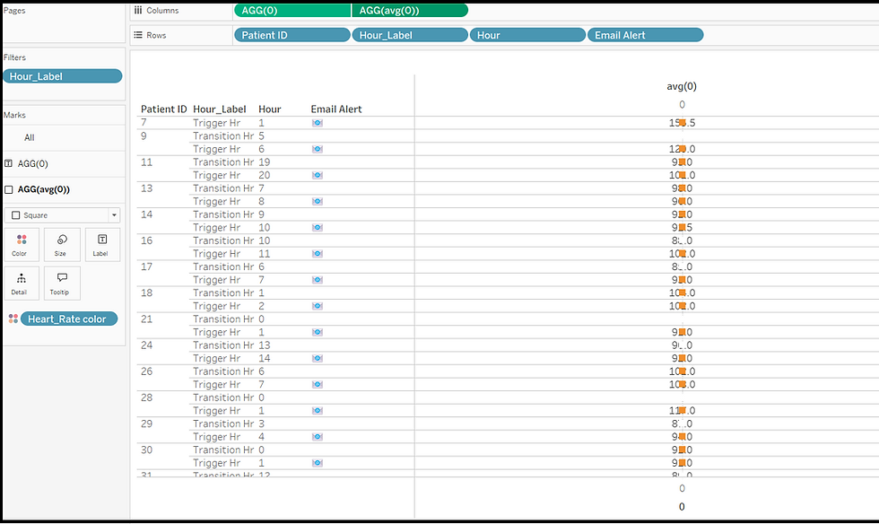
· Set up placeholders for the biomarkers by entering ‘0’ in the Columns section as shown below.

· Click anywhere outside and a placeholder AGG(0) will be created.

· Create a calculated field which will classify heart rate as normal and abnormal.

· Next, create a second placeholder to apply the condition for highlighting the abnormal heart rate values using the calculated field, Heart_Rate color. This time type avg(0) in the columns section and click anywhere outside. A placeholder AGG(avg(0)) will be created.

· In the Marks card, change Mark type for AGG(0) to ‘Text’ and now drag the biomarker “HR”(which denoted heart rate) to ‘Text’ button of Mark as shown below:

· In the Marks card, change Mark type for AGG(avg(0)) to ‘square’ and then drag and drop the calculated field ‘Heart_Rate color’ created earlier to ‘Color’ button as shown below:

· I edited the legend to apply colour only to the abnormal values. The choice of colours is up to you.

Step 4: Merging the two columns using 'Dual Axis' and adding a column header using 'Edit Axis'
· Select the ‘Dual Axis’ from the dropdown menu of AGG(avg(0)) in 'Columns'.
· After combining the columns, since the size of the square is small, increase it to cover the whole cell by sliding the bar for ‘Size’ in Marks card.

· Rearrange the placeholders to make the “HR” measure visible, by dragging AGG(avg(0)) in front of AGG(0).

· To add an appropriate column header, right click and select ‘Edit Axis’. Enter the title name as ‘Heart Rate’ in the ‘General’ section.


· Set the tick marks to ‘None’
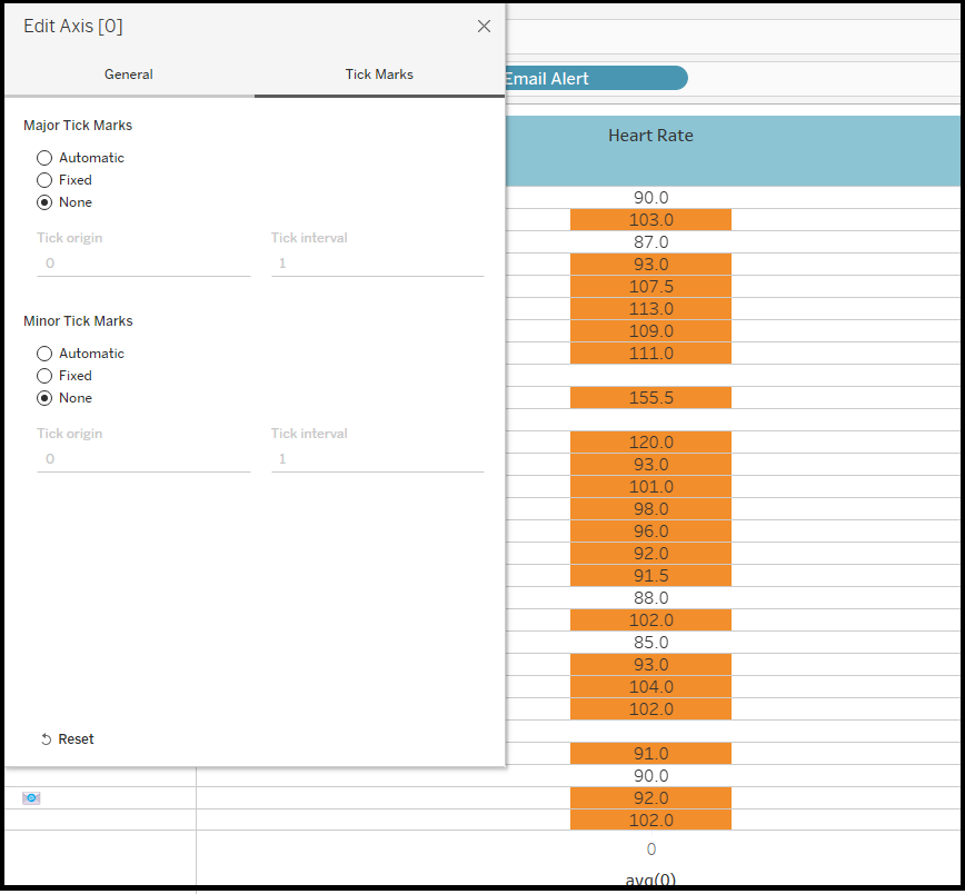
· For the bottom axis, apply the same changes to the ‘General’ and ‘Tick Marks’ sections as the top axis, but leave the title blank.
Step 5: Create colour-coded columns for all the other biomarkers
· The column for biomarker ‘Heart Rate’ has now been created successfully.
· Repeat the same process to create columns for the other four biomarkers i.e. Temperature, Respiratory Rate, PaCO2 and WBC.
· Once that is done the table will appear as shown below:

Step 6: Setting up the email alert using ‘mailto’, which adds a URL action on a dashboard button/shape
· We have already created a column ‘Email Alert’ which displays an email symbol at the trigger hour.
· Now, create two calculated fields, one for email body and the other for email subject.


· Add these calculated fields to the ‘Detail’ button of AGG(0) as shown below.

· Now go to ‘Worksheet’ tab in the ribbon above and click on ‘Actions’.

· Choose whether the URL action should work on an entire workbook or a particular sheet (here I am selecting sheet). In dropdown menu of ‘Add Actions’, select ‘Go to URL’.

· Give an appropriate name for the URL action and enter the following URL :

· Click OK, then go the dashboard email symbol at the trigger hour and click ‘Mail to on call doctor’.

· An email will as shown below, with the correct vital stats of the patient who transitioned to SIRS.

As you can see, this smart dashboard can save nurses and doctors time by quickly spotting anomalies. This will ensure patient safety and support faster recovery.
This example shows how colour coding and email alerts can turn tableau dashboards into effective early warning systems. Try it out with other datasets and you will be amazed by the insights and impact it can deliver!


