Building a Modern Operational Planning Dashboard in Tableau with Power KPIs


What Is KPI ?
Key performance indicators (KPIs) are important metrics that track a company’s progress toward achieving its strategic and operational goals.

In today’s data-driven world, dashboards are more than pretty visuals they’re strategic tools that teams to ask better questions and make smarter decisions. The Operational Planning & Target Setting dashboard showcases the highlights exactly that: how the intersection of interactive planning, KPI decomposition, and scenario analysis transforms static numbers into strategic insight. By leveraging extensions like Power KPIs within tableau. A reminder that when we blend data with clarity of purpose, hitting stretch goals becomes not just measurable, but genuinely achievable.
These KPI's play very important role in all Industries to measure performance of the area and to develop the organization.

In this blog, Lets see how to design a modern Operational Planning & Target Setting Dashboard using Tableau and Power KPIs from KPI framework design to scenario modeling and alert automation.
To quickly get started with Power KPIs, download the free Power KPIs viz extension from the Tableau Extension Gallery or your local viz extension . Trex file.
Power KPIs in Tableau transforms dashboards into dynamic decision grouping KPIs by category, enabling context menus, and scaling for teams. Its interactive cards and customizable layouts make performance tracking intuitive and visually compelling.

Below screenshot shows the Extensions folder inside My Tableau Repository, where custom .Trex files are stored to enhance Tableau dashboards. Each .trex file represents a visualization or dashboard extension like Sankey diagrams, sunburst filters ready to be integrated into Tableau. A new extension named "power-kips-fire-viz" is being saved, indicating active development or customization of a Power KPIs module for advanced KPI tracking.

Steps to be followed for adding Viz Extension in tableau Worksheet
The Tableau Desktop interface during the early stages of dashboard creation. On the left side we can see MARKS click the ‘Add Extension’.

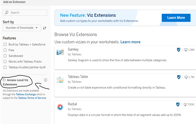
In this Tableau’s Viz Extensions interface, where users can browse and add custom visualizations to their dashboards. The panel highlights popular extensions like Sankey, Tableau Table, and Radial, each built by Tableau. Filters on the left allow users to sort by features such as “Free,” “Sandboxed,” or “Works with Tableau Public,” while the “Access Local Viz Extensions” checkbox enables integration of locally stored .trex files.
Open Power KPI Extension
1. In a new worksheet, go to Viz Extensions .
2.Then Add Extension modal, in the search field to find all Viz Extensions.
3.Power KPI Cards, then click Open.

Lets take the "Sample Store Data " Setting Tableau Dashboard with Power KPIs Viz Extension. Once the data set is uploaded to the tableau creates a relationship with people, return and orders once done with data.
Enter into the Sheet.
Create parameter
We are creating parameter for Power KPI's in tableau .
Tableau’s Create Parameter and Some Calculated field, where a dynamic input named “Price Change” is being configured.
The parameter is set as an Integer with a display format of whole numbers (0), and a range constraint from –30 to 50, stepping by 1.
This setup allows users to simulate price fluctuations interactively within dashboards ideal for what-if analysis, dynamic filtering, or scenario modeling.
By selecting “Fixed” and setting the initial value to 0, the dashboard opens with a neutral baseline, ready for user-driven adjustments.
These “parameters” and “Calculated Field “for set for Comparing the sales, Cost and Ratio for KPI comparison.

Calculated Fields for New KPI’s
New Price KPI's

Price

New Sales

Cost

New Profit

New Profit Ratio

Once Done with Calculated field. Follow the below Steps to Proceed with Power KPI’S
Then:
Add Measure Names to Measure Names (use Measure Names on Filter to filter to the relevant measures).
Add Measure Values to Measure Values.
Add a Order Date to Date.
Add a KPI dimension to Dimensions.
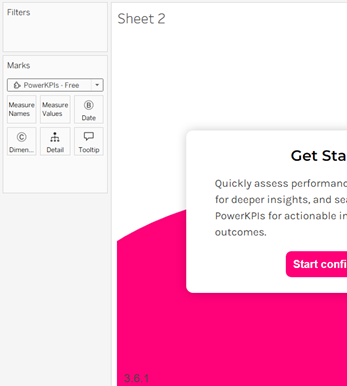
Once Added the Data in Marks our KPI Will be displayed

Source Sheet for Dashboard Extension
If you are using the Power KPIs dashboard extension, you need to create a source sheet first.
For Grid Layouts:
Create a worksheet with the data you would like to add to the Power KPIs.
Add Measure Names to Details.
Add Measure Values to Details.
Add a Date field to Details.
Optional: Add a KPI dimension to Details.
Add the worksheet to this dashboard
For Tree Layouts:
Create a worksheet with the data you would like to add to the Power KPIs.
Add Measure Names to Details.
Add Measure Values to Details.
Add a Date field to Details.
For Recursive data (parent-child) add a KPI and Parent KPI field to Details.
For Hierarchical data add the hierarchy in the correct order to Details.
Add the worksheet to this dashboard

This image shows the Power KPIs setup interface, where users choose between a Grid or Tree layout for displaying KPI cards. The selected layout KPI Grid—offers a clean, structured view ideal for comparing metrics across categories. Both the Data Structure and Visualization Configuration steps are marked completely, streamlining the setup process. With just a click on Save, users can deploy interactive KPI dashboards tailored to their analytic needs.
Depending on requirement, We can display KPI cards in a tree or grid layout.
Choose the grid layout if you want to display KPI cards in a grid as part of a dashboard or as a dedicated KPI dashboard.
Use the tree layout if you want to show a hierarchy within your KPIs or if you want to break down a specific KPI into its driving factors.
Then Select Tree Layout for Power KPI'S operational Planning.
Once We select the Tree we can see Options 1,2,3..
Select Option 2 :Build your own Tree in Power KPIs, enabling users to customize KPI hierarchies. By selecting multiple Measure Names like Profit, Sales, and Profit Ratio, users define the structure of their KPI tree. The Marks card shows how fields are mapped to dimensions, detail, and tooltips for interactive control. This setup empowers analysts to visualize performance metrics across time and categories in a flexible tree format.

Configure Visualization
Depending on the selected data structure, you need to map a few fields to configure the visualization.
KPI Cards:
In KPI cards , we can configure Dates, style, layout ,Precision .

KPI Configuration
This image shows the KPI configuration table in Power KPIs, where each metric is mapped to its display roles. Users assign Measure Names like Sales, Profit, and Quantity to both BAN and Chart views for clarity. The consistent “Main” role across all entries ensures uniform styling and layout in the dashboard.

KPI Dashboard Setup
In this Tableau KPI dashboard in edit mode, blending configuration and visualization .The central panel maps metrics like Sales, Profit, and Quantity to roles such as Main, Comp1, and Comp2 for comparative analysis. On the right, KPI cards display live values like Total Sales: 733.2K and Avg. Sale Price: 58.8 with bar charts for visual impact.
The left pane offers access to tables, measures, and parameters, enabling flexible data selection and field mapping. Together, this setup users to build dynamic & multi-source Dashboard.

Change all New KPI's to comp 1 and Give Save and build the own tree with New KPI
keep Cost & Profit ratio as Main Node
Comparing the metrics gives us nodes for Quantity, Profit, and Sales are nested under parent nodes such as cost or Profit ratio, forming a logical structure.

Once the Tree is build Our New Power KPI's Dashboard is Done .

Depending on the requirement we can change Number Format in to Decimal,percentage,whole number

Note :
We can Change the All-format Nodes,Links,KPI Cards Style, setup KPIS we can define Tool tips , and action which all are present in settings we can change depending on our needs .

Bar Chart :
With given stored data created a bar chart for filtering the KPI with Parameter Price Change to showcase the Power KPI's Operation.

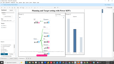
Final Dashboard Representation of Power KPI's Operation
Final Thought
Power KPIs provides a stable architecture for KPI standardization, scenario modeling, and multi‑metric monitoring. It enables developers to focus on data quality and business logic while the extension handles rendering, interactivity, and performance optimization. By centralizing KPI definitions, thresholds, comparison logic, and visual states within the extension, developers can enforce governance while still giving end users an interactive, high‑performance interface for operational decision‑making.


