Building a Heart Rate Recovery Dashboard with Streamlit

Why We Even Bothered With This
I’ve always found heart rate recovery fascinating. It’s not the flashiest metric out there, but it quietly reveals a lot about how fit you really are — like how fast your heart can chill out after being pushed hard.
During a recent Python hackathon, I figured, “Why not actually visualize this stuff?” I’d been sitting on some exercise test data from PhysioNet, and I finally decided to do something interactive with it.
Enter Streamlit — a Python tool that lets you spin up data dashboards without losing your mind. Honestly, I just wanted to experiment, but the whole thing kind of spiraled into my first little health-tech app.
About the Dataset
I grabbed the PhysioNet Treadmill Exercise Cardiorespiratory Dataset, which is pretty rich — second-by-second readings from real treadmill test sessions.
Here’s what the dataset includes:
ID_test: Unique test ID for each subject
time: Time in seconds since the test began
HR: Heart rate, measured in bpm
VO2: Oxygen consumption (ml/kg/min)
For this dashboard, I focused on the HR column — tracking how high the heart rate gets, and how quickly it comes down post-test. Classic recovery analysis.
Bonus: The dataset includes enough detail to explore fatigue signals, overtraining risk, and more — which I plan to explore in future versions.
What This Dashboard Actually Does
Here’s what I built with Streamlit:
Let users pick a Test ID from a dropdown
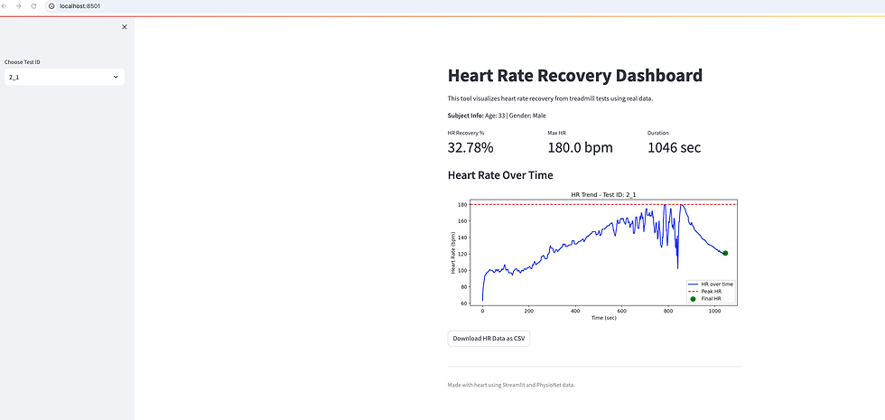
Show a line chart of heart rate over time
Display 3 KPIs:
HR Recovery % (from peak to end)
Max Heart Rate
Test Duration (in seconds)
Download the filtered data as CSV
Streamlit’s reactive magic means everything updates instantly when a new test is selected. I also left room for enhancements — like gender-based comparisons or fitness level overlays.
How I Calculated the KPIs (a.k.a. the math part)
When a test ID is selected, this happens:
selected_data = test_data[test_data[‘ID_test’] == selected_id].dropna(subset=[‘HR’])
hr_peak = selected_data[‘HR’].max()
hr_end = selected_data[‘HR’].iloc[-1]
recovery_pct = ((hr_peak — hr_end) / hr_peak) * 100
test_duration = selected_data[‘time’].max()
And the KPIs are displayed like this:
col1, col2, col3 = st.columns(3)
col1.metric(“HR Recovery %”, f”{recovery_pct:.2f}%”)
col2.metric(“Max HR”, f”{hr_peak} bpm”)
col3.metric(“Duration”, f”{test_duration:.0f} sec”)
Visual Goodies That Made It Click
What You’ll See in the Dashboard:
Line chart showing HR across time
Peak HR marked with a red dashed line
Final HR shown as a green dot
Subject Info like Age and Gender at the top
CSV download button for filtered HR data
Clean sidebar layout with test selection dropdown
It’s not flashy — but it’s intuitive and gives instant insights.
Stuff I Want to Add Later
I kept the MVP focused on heart rate recovery, but there’s so much more this dataset could do. Some ideas in the backlog:
Explore how age or gender affects recovery rates
->I’m curious whether younger individuals or different genders recover faster — there might be trends worth surfacing.
Flag subjects with slow recovery (>5 mins post-exercise)
->Could be useful for identifying fatigue, overtraining, or potential cardiovascular concerns.
Combine VO2 and HR to estimate fitness levels
-> VO2 is a gold-standard metric. Overlaying it with HR trends might offer more context on someone’s endurance.
Visualize conditions like altitude or temperature
->The dataset includes some environment data — it’d be cool to explore how those factors affect recovery.
I haven’t built these yet — but they’re definitely on my radar for version 2.0. If you’ve explored similar ideas, hit me up!
What I Picked Up Along the Way
This was more than a Streamlit experiment — I actually learned a lot:
KPIs help so much in turning messy data into digestible insights
Streamlit is a cheat code for building real dashboards without Flask or JS
Explaining your work (like now!) makes you actually understand it better
Real-world datasets = for practicing storytelling + analysis
And yeah, I had way too much fun making buttons and color-tweaking charts. Don’t judge.
Making It Public with Streamlit Cloud
We can host this on Streamlit Cloud to make it dead-simple to share:
Push your .py file to GitHub
Link GitHub repo to Streamlit Cloud
Hit deploy → instant live dashboard
No setup, no environment wrangling. Just Python, and go. I plan to link this in my portfolio too — feels like a good showcase piece for data + UI together.
Full Streamlit Code
Want to try it yourself? Save this as
hr_recovery_dashboard.py and run:
streamlit run hr_recovery_dashboard.py
import pandas as pd
import streamlit as st
import matplotlib.pyplot as plt
# Page setup
st.set_page_config(page_title="HR Recovery Dashboard", layout="centered")
# Title
st.title("Heart Rate Recovery Dashboard")
st.markdown("This tool visualizes heart rate recovery from treadmill tests using real data.")
# Load the data
try:
athlete_data = pd.read_csv('common/subject-info.csv')
test_data = pd.read_csv('common/test_measure.csv')
except FileNotFoundError:
st.error("Data files not found. Please check the folder paths.")
st.stop()
# Sidebar for test ID
test_ids = test_data['ID_test'].dropna().unique()
selected_id = st.sidebar.selectbox("Choose Test ID", test_ids)
# Filter data
filtered = test_data[test_data['ID_test'] == selected_id].dropna(subset=['HR'])
# Pull subject info
subject_info = athlete_data[athlete_data['ID_test'] == selected_id]
if not subject_info.empty:
age = subject_info.iloc[0]['Age']
raw_sex = subject_info.iloc[0]['Sex']
# Map numeric to labels
if raw_sex in [0, '0']:
gender = "Male"
elif raw_sex in [1, '1']:
gender = "Female"
else:
gender = "Unknown"
st.markdown(f"**Subject Info:** Age: {int(age)} | Gender: {gender}")
else:
st.markdown("**Subject Info:** Not found")
# KPI calculations
hr_peak = filtered['HR'].max()
hr_end = filtered['HR'].iloc[-1]
recovery = ((hr_peak - hr_end) / hr_peak) * 100
duration = filtered['time'].max()
# Display KPIs in columns
col1, col2, col3 = st.columns(3)
col1.metric("HR Recovery %", f"{recovery:.2f}%")
col2.metric("Max HR", f"{hr_peak} bpm")
col3.metric("Duration", f"{duration:.0f} sec")
# Chart
st.subheader(" Heart Rate Over Time")
fig, ax = plt.subplots(figsize=(10, 4))
ax.plot(filtered['time'], filtered['HR'], label="HR over time", color="blue")
ax.axhline(y=hr_peak, color='red', linestyle='--', label="Peak HR")
ax.scatter(filtered['time'].iloc[-1], hr_end, color='green', label="Final HR", s=100)
ax.set_xlabel("Time (sec)")
ax.set_ylabel("Heart Rate (bpm)")
ax.set_title(f"HR Trend - Test ID: {selected_id}")
ax.legend()
st.pyplot(fig)
# Download CSV
st.download_button("Download HR Data as CSV", data=filtered.to_csv(index=False), file_name=f"{selected_id}_hr_data.csv")
# Footer
st.markdown("---")
st.caption("Made with heart using Streamlit and PhysioNet data.")
Useful Links (If You’re Curious)
Dataset: PhysioNet Treadmill Test
Streamlit Docs: docs.streamlit.io
Cardio Health: Cleveland Clinic
PhysioNet Home: physionet.org


