Beyond Flat: A Dimensional Look on Metrics (3D)
- team04bhuvana
- Oct 6
- 2 min read

Author:Bhuvaneswari
Date:10/06/2025

We can enhance the visual impact of our bar charts in Tableau by using shaped bars. In this approach, we'll explore how to incorporate 3D-style shapes to simulate 3D bar charts, giving our visualizations a fresh and dynamic look. By following the below given steps we can easily achieve the 3D bar charts.
Step 1: Download the infographic images of different shapes

Step 2: Save the Infographic Image
Format: Save the image as a PNG (preferred for transparency), JPEG, or SVG (if converting to PNG later).
Resolution: Use high-resolution images for clarity, especially if resizing.
Transparency: If you want to overlay the image on charts or dashboards, save it with a transparent background (PNG format).
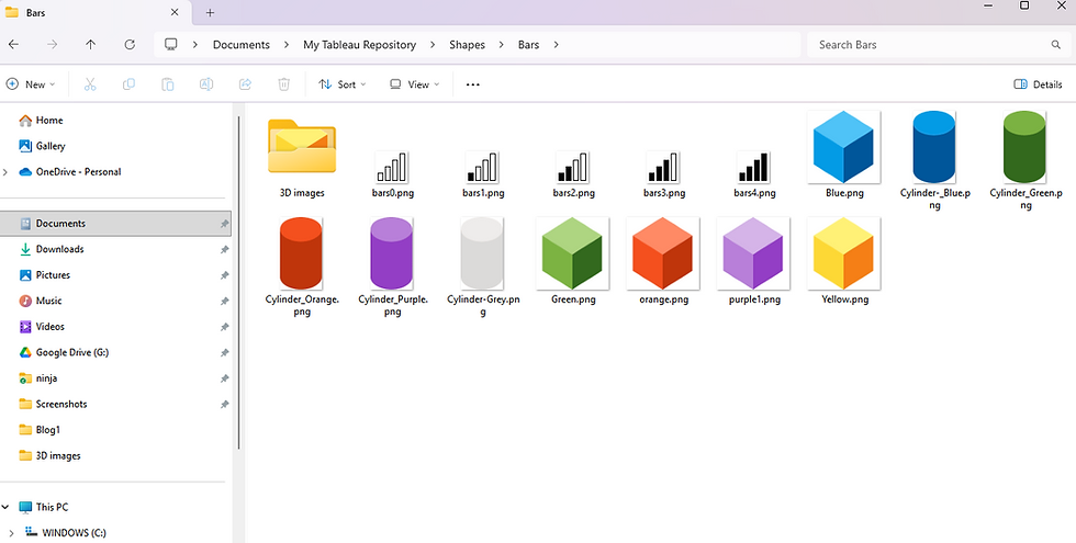
Step 3: Place in Tableau Repository (for Shapes)
If you're using the image as a custom shape:
Go to your Documents folder.
Open My Tableau Repository.
Navigate to the Shapes folder.
Paste your saved image(s) into that folder.
Step 4:We are going to use Sample Superstore data for our visualization. With our Dataset loaded to tableau We can build a straightforward bar chart in Tableau to display the total sales generated across different shipping modes

Step 5:Under Marks select Shapes

Step 6: The images downloaded and placed under Bars can be seen, if not click on Reload Shapes

Step 7:Select the 3D shape we wish to use

Step 8:Drag and drop Sum of Sales in Label

Step 9:Each Colored Cylinder is assigned to each Ship Mode

Step 10:Background color and other Format settings can be done along with Shape size changes if required.

We did it—our chart is ready to shine!!
Note: Although 3D data visualizations are generally not recommended as best practice due to potential misinterpretation, they can be effective in creating visually compelling infographics or infotainment pieces. When used thoughtfully, they add aesthetic appeal and can boost audience engagement in non-analytical contexts.
Thank You.


