Beyond Dashboards: Building the SIRS Email Alert in Tableau (Part 2)
In my previous blog, Beyond Dashboards: My Journey of Designing a SIRS Email Alert in Tableau (Part 1), I have written on why I moved away from a static dashboard and focused on building an email alert instead. I talked about the importance of timing, context, and how alerts should support real decisions, not just show data.
In this blog, I want to focus on the practical side — how I actually built the SIRS email trigger step by step in Tableau. This blog is less about theory and more about the real process I followed, including the decisions I made while designing the logic and the visualization.
Step 1: Understanding what needs to be flagged
The first thing I did was clearly understand which vitals are used to identify SIRS and what values should be considered abnormal. For this project, I worked with heart rate, respiratory rate, temperature, white blood cell count, and PaCO₂.
Before creating any charts or calculations, I made sure the medical logic was clear and correct. If this part is not understood properly, the entire alert system can become misleading. At this stage, two important ideas were also introduced Transition Hour and Trigger Hour to represent how a patient moves from normal condition to risk over time. These concepts helped shape the alert logic later on.
Step 2: Creating the SIRS score
Firstly I created separate calculated fields for each vital sign. If the value was outside the normal range, I marked it as 1. If it was within range, I marked it as 0. Once the abnormal conditions were clear, I created a calculated field called SIRS Score. This score simply adds up how many vitals are abnormal at a given hour.
Each vital contributes either 0 or 1 to the score. When two or more vitals are abnormal, the SIRS condition is considered met. This score became the foundation for deciding whether a patient is moving toward risk or not.

Step 3: Identifying the trigger hour
At this stage, I had hours where the SIRS score reached two or more. The next challenge was deciding when the email alert should be sent.
I did not want the system to send repeated emails every hour once SIRS was detected. That would be unrealistic and noisy. Instead, I wanted the alert to be triggered only once — at the first hour when SIRS occurs.
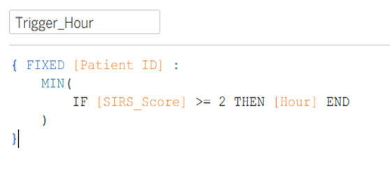
To do this, I created a calculated field using a FIXED Level of Detail expression. This calculation finds the earliest hour for each patient where the SIRS score becomes two or more. That hour is marked as the Trigger Hour.
The hour just before it is labeled as the Transition Hour, which helps show how the patient gradually moved toward risk. All other hours are clearly marked as “Do Not Send Email.”
This approach helped control alert timing and made the system feel more realistic.

Step 4: Designing the email trigger table
Before adding any alert actions, I first designed a table to clearly display how the logic works. This table became the backbone of the entire alert system.
The table includes patient ID, hour, hour type (Transition Hour or Trigger Hour), vital signs like HR, Resp, Temp, WBC, PaCO₂, and alert-related fields such as Email Trigger and Email Alert icon. For each hour, the table clearly shows whether an email should be sent or not.
To make it more intuitive, I used an email icon for trigger hours and a blocked icon for non-trigger hours. This made it easy to visually scan the table and understand exactly when the alert would fire.
Building this table first helped me validate the logic before turning it into an action.

Step 5: Creating the email trigger message
Once the trigger hour was identified and the email trigger table was created, I created a calculated field called Email_URL. This field builds a Gmail compose link dynamically, but only when the Email Trigger value is “Send Email.”
The email content is automatically filled with the patient ID, trigger information, and abnormal vitals such as heart rate, respiratory rate, temperature, WBC, and PaCO₂.. Due to this detailed email structure, doctors will get the proper information about patient and can understand his/her situation to take required medical actions.
This step helped transform the alert from just a visual indicator into something that feels actionable.

Step 6: Adding the email action in Tableau
After creating the Email_URL field, I connected it to Tableau using an action. I went to:
Worksheet → Actions → Add Action → URL
Here, I linked the Email_URL field so that the email is triggered only when the trigger hour condition is met. When I click the email icon/Send Email, a compose email box with all the patients details pre-filled is opened by Tableau.
Through this step the alert logic is connected to an actual interaction. Without this action, the alert would remain static and incomplete.


When we click the email icon, Tableau opens a send email draft with all the patient details already filled in which is ready to send. This makes it easy to understand why the alert was triggered without needing to search through the dashboard.

How close this is to real hospital alerts
The email alert built in this project is a simulation of how early warning systems work in real hospitals. Most importantly this alert focuses on identifying risk early, choosing the right moment to alert, and presenting only the most important patient details so quick decisions can be made by the medical staff.
Basically, Tableau itself is not a hospital messaging system, but the alert logic closely mimics real-world workflows. In practice, similar logic would be connected to clinical databases and hospital communication platforms. What matters most here is the thinking behind the alert - when to notify, what information to include, and how to avoid unnecessary alerts.
Final thoughts
Building this SIRS email alert helped me move beyond simply creating dashboards. It helped me understand how analytics can support real life decisions by combining logic, timing, and clarity. Now, I not only focus on how the visualization looks, but also I learned to think about how someone would actually use the information.
This project helped me understand how data can be transformed into meaningful actions, especially in healthcare, where timely alerts can make a real difference.
Thank you for reading!


