Applying Prescriptive Analysis Using PhysioNet Data: My Python Hackathon Experience

Introduction
I recently participated in a Python Hackathon where the main goal was not only to analyze healthcare data, but to recommend actions based on data. The dataset used in this challenge was Physionet which contains health care informatin such as patient age, symptoms and COVID test results.
This hackathon experience helped me to understand how prescriptive analysis can transform raw healthcare data into meaningful insights using Python.
Understanding the Hackathon problem
The challenge was based on a real healthcare scenario. We were given patient-level data including: Age cateogories, COVID 19 survey data, Symptoms such as shortness of breath.
The main problem was that based on patient data, who should be prioritized for testing and medical attention. For this problem, the simple averages are not enough. We needed a decision-oriented approach, which led us to prescriptive analysis.
Prescriptive Analysis
Prescriptive Analysis focuses on what action should be taken next. In healthcare, this is very important because some patients are at higher risk, delayed decisions can increase severity. The goal of this hackathon was to identify high-risk groups and recommend clear actions such as prioritization, monitoring and needed immediate intervention.
Data Preparation using Python
Before analysis, the dataset has to be cleaned and prepared using Python by merging COVID survey schemas into a unified dataset, standarized responses such as y/n/NR, handled duplicate and missing values and created derived variables for symptom groups, exposure indicators.
This step was critical because prescriptive decisions must be based on reliable data, otherwise the insights shows inappropriate data.
Visualization created during the Hackathon
To understand the relationship between age, shortness of breath, and COVID status, I created a violin plot using Python.
This visualization shows:
Age distribution across symptom presence.
Comparison between COVID-positive and COVID-negative cases.
Data spread instead of just single values.
This visualization helped to reveal risk patterns, which is essential for decision-making. Unlike bar charts, violin plots reveal patterns and risk which is very important for decision-making.
Why This Methodology Works in Real-World Projects
This approach is similar to methods used in real healthcare analytics problems:
In Sepsis prediction, patients are analyzed over time to trigger alerts.
In Diabetes analysis, patients are grouped by age and glucose trends to suggest lifestyle or medical issues.
By combining visualization with prescriptive logic, the analysis moves from simple reporting to decision support, which is the goal of real-world healthcare analytics.
Code:
Below is the Python code I used during the hackathon to clean the data and to create the visualization.

Key Insights from the analysis:
From the violin plot, several important patterns became clear:
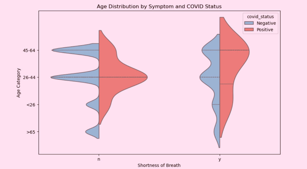
COVID-positive cases with shortness of breath are more common in adult (26–44) and middle-aged (45–64) groups.
Older patients show higher variability, indicating higher risk.
Younger age groups have fewer severe symptom-positive cases.
These patterns are difficult to see using tables or averages alone and highlight the importance of visualization in healthcare analysis.
Prescriptive Actions Derived
Based on these insights, the following prescriptive actions were derived:
Patients aged 26–64 with shortness of breath should be prioritized for COVID testing.
Patients above 65 with breathing difficulty should receive immediate medical attention.
Younger patients without severe symptoms can be monitored.
This directly answered the hackathon objective by recommending what should be done, not just what the data shows.
What Made this a Strong Hackathon Solution
The approach focus on decision-making, not just visualization and it used real health-care logic. Prescriptive analysis helped convert insights into practical healthcare recommendations, which is a key requirement in healthcare-focused hackathons.
Technical Challenges Faced
During the Python hackathon, the main challenge was working with messy healthcare data. The dataset contained missing values, duplicate records, and inconsistent formats such as Yes, No, and NR. To solve this, I used Python to standardize all categorical responses, merge schemas into a single dataset, handle missing and duplicate values, and create derived variables for symptom and exposure groups. This step was critical because prescriptive decisions must be based on clean and reliable data.
Another challenge was choosing the right visualization. Simple averages and bar charts failed to show risk variability across age groups. To overcome this, I used a violin plot to clearly see how age distributions, symptom, and COVID status were related. The challenge part was to convert analysis into actionable recommendations. Finally I focused on translating insights into simple and clear healthcare actions.
What I Learned from the Hackathon
This hackathon taught me:
Data analysis is only useful when it leads to action.
Python is powerful for fast, real-world problem solving.
Visualization plays a key role in prescriptive decision-making.
Most importantly, I learned how the data should be analyzed for better visualization and not just reports.
Conclusion
The participation in the Python Hackathon helped me to understand the value of Prescriptive Analysis. I was able to convert the raw healthcare data into meaningful insights.
This experience strengthened my skills in Python, healthcare analytics, and problem-solving and showed how data-driven decisions can create a strong real-world impact.


