A Practical Guide to Building Radial Charts in Tableau
Radial charts aren't a native feature in Tableau, so they require a bit of a math workaround. But if you want to move beyond basic bars, they’re a great way to visualize proportions. They take standard sales or patient data and wrap it into a much more engaging, circular layout.

Here is a guide on how to build the "Count of Patients by MOD Severity" radial chart.
What Is a Radial Chart?
At its core, a radial chart is just a bar chart that’s been wrapped around a circle. Since most BI tools (like Tableau) don’t have a native "Radial" button, you have to build them from scratch using a bit of trigonometry—specifically sine and cosine—to map your data points onto X and Y coordinates. Basically, this of this as a clock face. To place a data point, you need to tell Tableau its X and Y position on a grid.
This is where the trigonometry comes in:
Sine ($sin$): This calculates the horizontal (left-to-right) position.
Cosine ($cos$): This calculates the vertical (up-and-down) position.
By using these functions along with the "angle" of your data, you’re essentially "bending" a straight bar around a center point.
When (and When Not) to Use Radial Charts
While radial charts are visually appealing, they should be used thoughtfully. They’re great for high-level overviews, but they aren't built for precision. Because the data sits on a curve, it’s much harder for the human eye to judge exact differences than it is with a straight bar chart. That’s why I recommend using them for storytelling, executive summaries, or any dashboard where keeping the user engaged is just as important as the data itself.
In our healthcare dashboards—like the MOD Severity view—we use radials to highlight patterns rather than raw numbers. It’s easier to spot the "shape" of a distribution or see which category is dominating the mix when it’s laid out in a circular flow. You'll see this work well in sales and operations, too, especially for tracking progress toward a goal or showing completion rates.
Just remember: if your audience needs to squint to see tiny numerical differences or track a trend over a long period, a radial chart will probably frustrate them. In those cases, a standard bar or line chart is still your best bet. Think of radial charts as a stylish way to add variety to your report, not a replacement for your core analytical tools.
Bringing Curves to Your Data: A Guide to Radial Bar Charts in Tableau
Standard bar charts are great, but sometimes your data deserves a bit more "flow." Radial bar charts use trigonometry to plot points in a circle, creating a nested look that is both informative and visually striking.
In this walkthrough, we’ll use the logic behind the MOD Severity dashboard to show you how to build one yourself.
1. Making the path: Data Densification
Tableau usually only draws marks where there is data. To get a smooth curve, we need more "points."
The Path: You’ll need a helper file or a join that creates a "Path" from 0 to 270 (representing the degrees of our 3/4 circle). While a full 360° circle looks symmetrical, it’s actually a bit of a nightmare for readability. If you wrap the bars all the way around, the start and end points touch, making it look like a solid donut. By stopping at 270°, you leave a 90° "open" segment at the bottom. This is the perfect spot to place your category labels or a legend without them overlapping the data.
The Bin: Right-click your Path field and create a Bin with a size of 1. This "densifies" the data, giving Tableau 271 points to draw lines between.
2. Defining the "Who" and the "How Much"
Before we get to the math, we need to categorize our data and calculate our percentages.
Categorizing Severity: We grouped patients based on their MOD Score to see where they fall on the scale. This dimension is used for color, labels, and grouping in the chart.

Calculating the Length: How long should each bar be? We compare the patient count for a specific category against the maximum count across all categories.
@patient count: This returns the patient count per severity category.
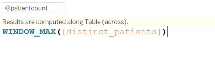
@maxpatientcount_all severity category: This value is used to normalize the data for consistent scaling.

@percentage: This converts the patient count into a percentage relative to the maximum category value.

3. The Math
To turn a flat line into a circle, we need to map our points onto a grid using $X = \cos(\theta)$ and $Y = \sin(\theta)$. Here’s how we break that down in Tableau:
The Angle (Index): We use INDEX()-1 to tell Tableau exactly which degree (from 0 to 270) it’s currently drawing.
The Radius (Rank): To keep the bars from overlapping, we use RANK_UNIQUE. This assigns each category its own "lane," stacking them from the center outward.
The Final Formulas:
X-Axis: COS(RADIANS([index]*[@percentage])) * [@Rank]
Y-Axis: SIN(RADIANS([index]*[@percentage])) * [@Rank]
4. Building the View
Now, let's put the pieces together in Tableau:
Columns & Rows: Drag your y calculation to Columns and x to Rows.
Detail: Drop your Path (bin) onto the Detail shelf. This triggers the Index and "explodes" that single dot into 271 points.
The Marks Card: Change the mark type from "Automatic" to Line.
Path: Drag your Path (bin) again, this time onto the Path button on the Marks card. This tells Tableau to connect the dots in order.
Color & Labels: Drag your severity_category to Color and use your patient counts for labels.
5. The Finishing Touches
A radial chart looks messy if you leave the default Tableau styling on. To get that "HUD" or "Dashboard" feel:
Hide Headers: Right-click the X and Y axes and uncheck "Show Header."
Clean the Grid: Go to Format > Lines and set Grid Lines and Zero Lines to "None"
Sizing: Slide the Size bar up. Radial charts look much better with thick, bold lines than thin, spindly ones.
Performance and Design Tips in Tableau
Since we’re using math tricks like data densification and table calcs, these charts can get a little "heavy." If you notice your dashboard starts to lag, here’s how to lean it out:
Watch your data size: Don't try to plot 50 different categories. Keep it to the essentials, or pre-aggregate your data before it even hits Tableau.
Extracts are your friend: Avoid live connections if you can. Using a data extract will make the "draw time" feel much snappier for the end user.
The "Crayola" Effect: Because these charts are so visually dense, too many colors will make your user’s head spin. Stick to a simple palette—maybe different shades of one color—and save the bright, bold "look at me" colors for the categories that actually need attention.
Less is More: You don't need a label on every single bar. Use clean tooltips to show the raw numbers so the chart itself can stay uncluttered and easy on the eyes.


