3 Ways to Make Handsome Highlight Tables in Tableau
- GAURI Mahindrakar
- Sep 2
- 4 min read

Hello Readers,
Welcome to the world of Tableau. Let's start.
To draw a highlight table in Tableau, you need one or more dimensions and exactly one measure. This is the same criteria to draw a raw text table in Tableau, except with a highlight table, you are limited to one measure instead of one or more measures. This one measure is what encodes the cells in the table by the preattentive attribute of color. It's essentially a spreadsheet with colored cells.
The highlight table is my favorite chart type for introducing the value of data visualization. Highlight tables are more engaging and effective than a text table/crosstab view, but the next three tips aim to provide more ways to make your highlight tables even better in Tableau.
👍 Tip 1 :
# How to Make a Highlight Table in Tableau
I’m going to make a quick highlight table in Tableau using the Sample-Superstore dataset.

Select sheet 1.
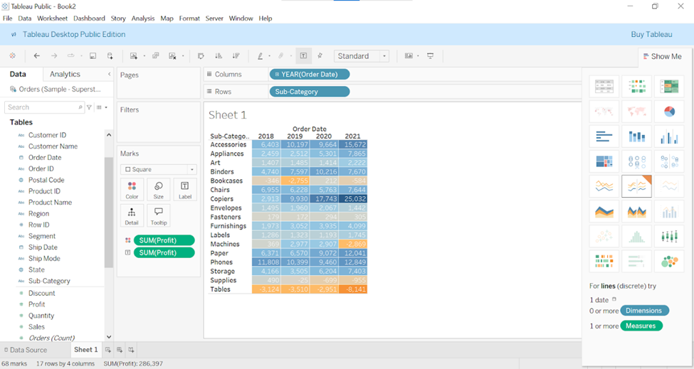
For this example, lets preselect the fields Order Date, Sub-Category and Profit. Then in the upper-right corner of the authoring window, in the Show Me pane, select the Third option on the top row, highlight tables:

This generates the following view:

As you can see, the cells are colored on a diverging spectrum with the worst profit values colored a dark orange and the best profit values colored a dark blue.
# How to Format Marks for a Highlight Table in Tableau
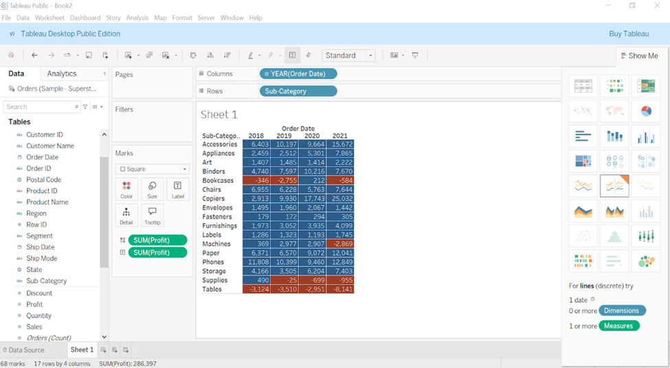
My first tip to creating more engaging highlight tables involves using the formatting options available to us in Tableau. Whenever I create a chart type and themarks are touching, I like to add a white border around the marks to provide a clean-looking separation.
To add a white border around the marks, click the Color Marks Card, click the Border drop-down box and then on the color palette that opens, change the color from none to white (or color of your choice).


Regarding the labels, some of the values are coloured black, whereas others are colored white. So I typically like to change the labels to white. To do so, click the Label Marks Card, click the Font drop-down box and then change the color to white.

👍 Tip 2 :
# Use Colors in Moderation
Notice in the highlight table created above that the colors for the values of -$25 and $294 are very challenging to differentiate - one cell represents profitability and the other represents a loss, yet they are both colored gray because they are in the middle of our diverging color spectrum.
This would be easier to differentiate if my highlight table were limited to two colors: one for positive values and one for negative values.
To make this change, double click the Color legend. It will open the Edit Colors dialog box.

Select stepped Color option, lowering it to two will show one color for positive values and another color for negative values. Click on Apply.

You can also customize the colors being used on each end of the spectrum by clicking the colored square (dark red and dark blue) on each end of the palette and choosing different colors.
Here is how my highlight table looks after reducing the steps to two and choosing two custom colors:
With this technique, the values -$25 and $294 mentioned earlier have been classified as red for negative and blue for positive respectively. It makes the highlight table easier to analyze.
👍 Tip 3 :
# Color Cells Based on a Discrete Segmentation
Two colors will not be enough for every objective. Let’s assume that we want to color the cells red if profit is negative, blue if profit is above our goal of $10,000 and gray for every remaining value.
To get this effect on other chrt types, you would start by setting up a calculated field like this:
IF SUM([Profit]) >= 10000 THEN "Goal Met"
ELSEIF SUM([Profit]) < 0 THEN "Negative Profit"
ELSE "Other"
END


Click on Apply and Drag the newly created calculated field to colors it will show as AGG(Profit Segmentation).
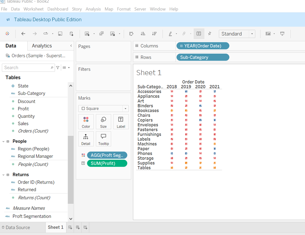
This is happening because we are now encoding the square mark type by a discrete calculated field rather than a continuous measure. Even when we increase the size marks card, the highlight table doesn’t look right, because the squares bleed into neighboring cells.

There is a trick for perfectly coloring the cells between the lines.
If you add a second discrete field to both the Columns Shelf and Rows Shelf, this will correct the grid. The trick is instead of choosing another dimension from the dataset or replicating the fields already on the view, we have to add a blank dimension by just double clicking an open area of the columns shelf, type two double quotation marks (“”) and hit enter. Repeat this step for the rows shelf. Here is the view looks after adding a blank dimension.


To hide the headers, right click on newly created dimensions and then deselect the show header option.
When you create a highlight table using discrete fields, the border formatting is no longer on the color marks card but controlled by the row divider and column divider options on the format pane. To access the format options, right click anywhere on the view choose format and then click the borders tab. You can choose not only different colors but different line styles and weights.

Here is how final highlight table looks after incorporating all of the tips

Compared to the default highlight table, we have not only enhanced a text table to introduce the value of the preattentive attribute of color but also we have made it easier to answer our business question while improving the design of the highlight table.


Happy Learning!


